Simple Dining Room Improvements
How to Update Dining Room on a Budget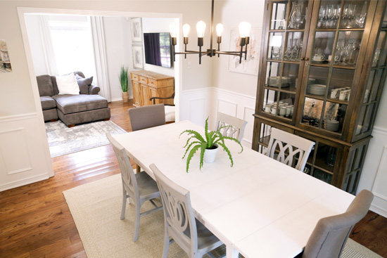
A little paint and some molding goes a long way in updating a small-looking dining room!
One of my goals for 2019 is to invite people over to our house for dinner. I love cooking. I love feeding people, especially people I don’t have to beg and bribe into eating like 2 certain toddlers who are frequent diners at my house…And I love having friendships we can nurture.
And where do meals and dining take place? The dining room, of course! But since I’ve already shared several updates we’ve made to our dining room over the years (like adding trim to a cased opening, installing board and batten, and other small updates), I thought I’d share another way to update your dining room on a budget!
This project was completed on Today’s Homeowner, so watch the full episode online now for more details about what we did!
Paint Goes A Long Way
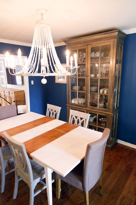 Now I’m not totally against a deep, rich color. I think the right color can add depth and class to a room. Unfortunately for this dining room, this particular blue was a little too bright and not deep enough. Plus with the dark wood china cabinet and oversized light fixture, it made the room feel so small!
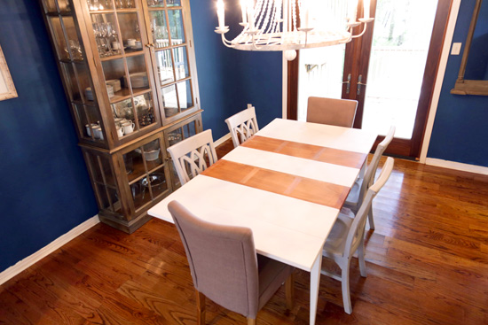 So changing the wall color was the first priority for these homeowners, understandably! Not to mention painting a space is about the cheapest improvement you can make. And sometimes it has the biggest payoff!
Add Molding
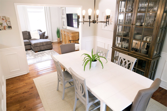
Another priority for this homeowner was adding chair rail and a wainscoting-look beneath it. I think wainscoting is so classic and never goes out of style! Plus with the modern, classy look they’ve created in the rest of the house, this type of molding update fits right in!
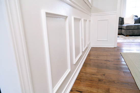
This is actually ‘faux’ wainscoting since we just adhered molding frames onto the wall. It’s a pretty easy process once you get past the math! (Here’s a video on how to do it.) You want the panels in each wall section to be the same size as each other and equally-spaced top to bottom.
One thing we did a little different is use PVC molding. Since it’s so thin, a wood molding in the same shape would be prone to splitting when nailed together. Instead, we were able to use PVC glue and our nail gun in each corner to create the frames before attaching to the walls with construction adhesive and a few nails.
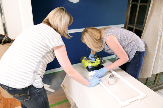
We used a small block cut from scrap wood as a spacer. Leigh Dale (the homeowner) held the block on the underside of the new chair rail while I slid the wainscoting panel up to it and used 1-2 nails to hold it in place while the construction adhesive dried. As with most DIY projects, it was easier with 2 people but can be done by yourself!
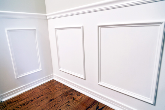
Once all of the panels/frames were secured to the wall, we came back with a semi-gloss trim white paint and painted everything from the chair rail down to the baseboard to make it all cohesive and look like real wainscoting.
Change Molding
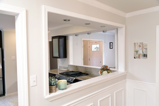
One thing that was kind of weird in this house was the molding around the pass-through opening into the kitchen.
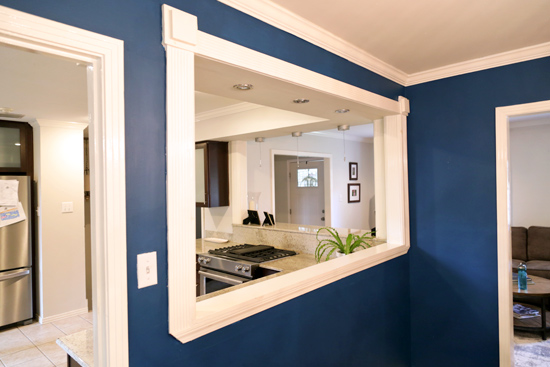
It’s called fluted molding and is more traditionally seen on the exterior of a house around a front door. And mostly on older homes. It was out of place here and oversized. So we removed it to make way for new molding that matched the rest of the house-colonial casing.
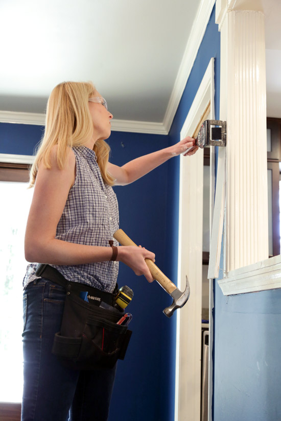
While we were at it, we also widened the horizontal surface in the opening with a pre-primed 1×8 to make it easier for passing dishes into the dining room.
Lighting is Important
I’ve already mentioned that the light fixture was too large for this room. It was actually wider than the table itself. The homeowner, Leigh Dale, brought it to this house from their old house where they had a foyer with 12-foot ceilings.
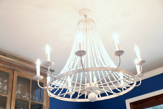
No doubt it was a beautiful fixture, but in this case it was only contributing to the room feeling small. So a more streamlined fixture was in order. And the one Leigh Dale choose was perfectly light-weight in that you can see through it and it doesn’t have a lot of ‘stuff’ that adds visual weight and fills up the room.
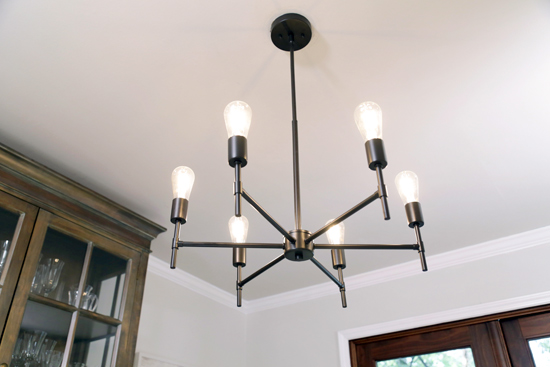
I don’t think anyone can deny that the new version of this space is so light and refreshing compared to its darker, former self! I simply L-O-V-E it! And I’m guessing Leigh Dale does too.☺️
Have you ever installed wainscoting? In which room? It used to scream dining room to me, but I’ve seen it in other rooms of a house and love it pretty much anywhere now!
Thanks for Checking In! ~Chelsea
PS-If you live in or around Mobile, Alabama, you can apply to be on Today’s Homeowner! Fill out this form and you may be contacted by our awesome producer, Allison! But be warned-I’ll eat all of your snacks and drink all of your coffee!


One Comment
Debbie
When I purchased my home it was so plain and the foyer was a long boring, dark hallway. I added wainscoting at 43″ (odd but I had to allow for enough room between the lower crown and the chair rail to accommodate a large mirror). I also ran wainscoting up the staircase bringing it right above the handrail. What a change it made. My dining room is on the smaller side so I want to add one wall of shoulder height wainscoting capped with a picture rail and add crown moulding mimicking that which is in the foyer. It’s amazing how a little wainscoting dresses up a home and can take you from a builder’s grade box to a warm retreat.