Bathroom Planning: Design and Layout
Putting Together All the Elements of a Bathroom

The design, style, and layout of our small, master bathroom addition. Traditional meets modern while balancing budget and splurge!
Finalize Floor Plans
After all of my thoughts and musings on bathroom vanities, showers, toilet rooms, and closets, I had a pretty good idea of the layout and measurements of our bathroom addition. But in order to get a permit for building, you need more official floor plans than a sketch on a piece of scrap paper.?
So I worked with a draftsman to draw up our plans. Since I have strong opinions, a decent background in this type of thing, and a General Contractor on speed dial, I didn’t need as much advice from the draftsman as others might. But if you’re working with one on your project, they should be knowledgable on current building codes for your area. Otherwise it might require multiple revisions, aka more money out of your pocket.
And I’ll also say, the more you know about what you want before soliciting the help of an architect or draftsman will help save you money as well. Our total spend to get our floor plans and other required drawings for permitting was $910. Speaking of money, I’m planning to do a full post once our addition is complete with every last penny we spent on it. Would that be helpful? Let me know in the comments!
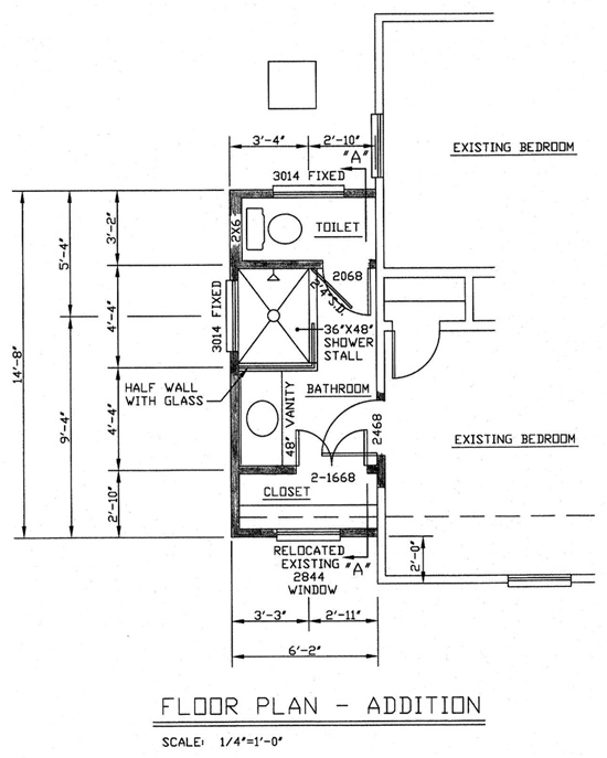
Without further ado, here is the layout currently being adding to our house!

I don’t use floor plans for the types of projects I usually undertake, but I find them fun to look at and decipher the different terms and symbols used! To orient you a bit, the bottom of the plans is the front of our house. The addition is ‘recessed’ 2 feet back to match a previous addition on the other side of the house. The entrance to the bathroom is adjacent to the existing closet in our bedroom.
The dimensions of the outside are 6 feet 2 inches wide by 14 feet 8 inches long.
My last little tip on floor plans is to get them as close as possible to what you want just to eliminate any communication errors between you and your contractor. Since they’ve already started building this addition at my house, I can see how smoothly and quickly they can operate if they don’t have to check with you at every little step along the way!
Design Plan Breakdown
It took me a long time to figure out what to select and buy when it actually came time to buying the vanity, tiles, etc. for this room. I like too many different styles! I drug and drug my feet until finally had an epiphany, so to speak! Ha!

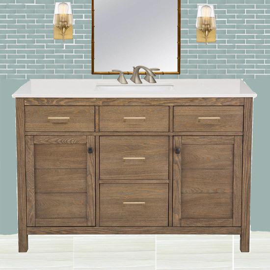
What we’re doing is creating a tile accent wall with oversized seafoam blue/green subway tiles. They’ll be 3 x 12 and cover the entire wall behind the vanity, the inside of the shower up to the ceiling, and the outside of the half wall between the vanity and shower. Should be quite the statement.
And since it’ll be quite the statement and expense, we’re keeping it simple on the floor tiles with 12×24 grayish tan ones.
The vanity was the hardest selection for me (until it came time to select light fixtures…) I love the clean look of white cabinets. But I’ve always felt like I took the ‘safe’ route when I updated my kitchen 7 years ago and I didn’t want to have that feeling about this bathroom. (I’m thinking about doing a post full of the changes I’d make in my kitchen if I were to remodel it all over again. Let me know in the comments if you’d like that kind of post!) I also love the look of gray cabinets. But once I had my mind set on the blue/green wall tiles, I thought gray didn’t fit as well. So a lightly stained cabinet it is!
It won’t be this exact cabinet, but it’ll be a similar one I’ll be staining and installing myself for an episode of my web series!
Size and Scale
While my mockup of our vanity area isn’t quite to scale (the tiles are probably too small in the picture), size and scale are important when you’re putting a whole room together!
And that’s why I had so much trouble picking out light fixtures! I desired a tall, skinny sconce on either side for a dramatic look. In fact, I ordered a pair like this one*. When I opened the box I laughed at how huge they seemed in real life. Even though I had checked the measurements online beforehand. Since our vanity is only 48 inches wide and will be surrounded on either side with a wall (closet on the left, shower on the right), that style of sconce was just not appropriate. It would have looked like a mistake and a bit silly for such a small space.
I’ve ordered, but have yet to receive, the sconces pictured in my mockup. They’re 5″ wide and 9.5″ tall. So they should fit nicely next to the mirror I bought secondhand from Facebook Marketplace! Gotta save where I can since I have a natural proclivity to expensive things.?
It’s a double-edge sword picking out things for a remodel or addition. It helps to have the room framed for making these kinds of decisions. Seeing the physical limits of the space helped me figure out that the original sconces I picked out would not work, since I’m not a professional interior designer! But at the same time, if you wait until it’s time to install each thing before picking them out, the project will take forever! The last thing you want when you have a hole in your bedroom wall is to have to wait on something to be delivered!?
I’m posting more regular updates on the progress of our bathroom in my Instagram stories, so follow me there if you’re interested! We already have it framed and shingled and just passed our electrical rough-in inspection. Once plumbing in the walls is done, we’ll be installing drywall! Whoop!
But the most exciting thing is wondering which will come first, the completion of the bathroom or baby #3??! It’ll be close at the rate the guys have been moving so far!
Thanks for Checking In! ~Chelsea


2 Comments
Marsha
I love the vanity. It’s exactly what I ‘ve been looking for. Where did you buy it?
Toni & Mike Padgett
Will be doing a large remodel on a house in Marianna, FL sure wish I could get you and your dad to make a visit home and help me figure out what do do! You both have such a eye for it and love all your ideas!